Katie Chase

Summary
Problem
With over 60,000 products on site, ASOS customers are overwhelmed by the amount of choice available and have difficulty finding products they are looking for.
In addition, with limited product visibility on listing pages, users have to dip in and out of Product Display Pages to get a better understanding of whether they are interested in a product.
Solution
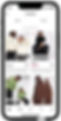
I developed a swipeable image gallery feature for small view ports (iOS, Android and Mobile Web) available on all products on the Product Listing Page with an onboarding animation to educate customers about the feature.
Customers can swipe back and forth through images with bounce interaction shown when they have reached the final or first image and can no longer swipe. Check out the live feature on the ASOS iOS app!
Result
The positive outcome from A/B testing this feature resulted in it being rolled out to 100% of customers across all markets on the iOS app. Testing on Android and mobile web is to follow.
My role
I worked as the sole Product Designer on this project. My primary responsibilities were completing competitor analysis, designing solutions, running user tests and delivering designs through to development.
I collaborated with my Product Manager to define the hypothesis and success metrics and complete quantitative data analysis.
Discover
After a successful experiment was run on desktop web to show customers a second image on hover on the product listing page (increasing conversion by +0.84%), my Project Manager (PM) tasked me with developing a similar feature for our iOS/Android apps and mobile web.
To begin, I defined the customer problem and goal and the business outcome to share with stakeholders to ensure we were aligned on the problem which needed solving.
To further explore this known problem area, my PM and I analysed different quantitative data points to better understand how seeing more images impacts customers' understanding of products and their likelihood to purchase.
We found that customers who see more than 1 product image on the Product Display Page (PDP) are roughly +23% more likely to convert than those who don’t. This further validated the opportunity that showing more images to customers, but this time earlier in their journey, could help them with finding products they’re interested in.
Before getting started with design explorations, I analysed similar features on 12 competitor apps to understand how they approached this type of feature which is becoming commonplace in the eCommerce landscape. The analysis focused on looking at; interactions, if indicators were shown, transitions from one image to another and how brands onboard this feature to their users.


Define
Once we felt confident we understood the problem space from a customer and business perspective, we defined the following hypothesis and success metrics.

Develop
Next I moved onto the design phase, which is always one of my favourite stages in the design process. I began by looking at our existing experience on PLP and mapping out scenarios and potential constraints for the final solution.
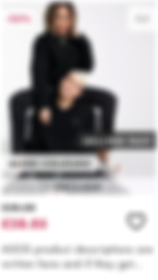
At ASOS, we can have up to 6 labels which feature on the image for our product tiles. This can result in a cluttered experience. It was important for me to consider this worst case scenario with all labels when designing a solution. Furthermore from a business perspective, our Studios Team (who shoot all product imagery) have a preference for keeping messaging off the images in order to showcase their work clearly.
Below you can see my explorations including designs which feature indicators in different forms like dots and arrows and also designs which are more based on swipeable interactions.
After sharing the designs for feedback with my PM and considering the business requirement to not add additional messaging to the product images, we decided to user test a solution where we onboard the user to the feature with an animation and allow them to view the additional images by swiping.
After a positive round of testing, we iterated the designs and implementation logic based on user feedback which included: providing an indication that users had reached the end of the gallery to avoid unsuccessful swiping or frustration and ensuring the onboarding animation was included on every PLP to remind users about the feature. Scroll below to check out the full report.

iOS Product Tile
mWeb Product Tile

Android Product Tile

Deliver
After my designs had been validated by users and iterations completed, I created a handoff document for developers featuring the specs for the onboarding animation and high fidelity prototype showcasing the gallery interaction. This was followed by multiple refinement sessions with developers where I reviewed test links to check the animation and interactions.
Once the feature was approved to go live, I created a set of components for our Design System in Figma allowing the team to use them across their designs.
Finally, I designed an animated video for the ‘What’s new’ onboarding screen for iOS. This was shown to customers when they first went onto the app once the feature was live.


Learnings
-
Prototyping and animation: This project really helped develop my prototyping and animation skills in Figma. I taught myself how to prototype the image gallery functionality through creating a component set. It took a few gos to get right but now I feel comfortable with creating this type of interaction. I had also never done any animation in Figma before. It was fun to play around with the Smart Animate feature and produce a short onboarding video I'm proud of. I've still got lots to learn!
-
Designing for worst case scenarios: When designing at ASOS, thinking about edge cases and worst case scenarios is always front of mind. This is due to the number of markets, varying languages and design nuances we have depending on device. It was challenging designing a solution which catered to the varying labels we have on images but I was pleased I explored these early on in the project so that I could consider all design options.
-
Collaborating with developers: During this project I learnt how to handoff animations and interaction heavy prototypes to developers. It was positive collaborating with them to review test links and ensure the end result reflected the designs.